


Overview
Slimming World Kitchen offers a flexible subscription service for healthy, home-cooked meals. Our goal was to redesign the pause and cancellation journey to reduce friction, improve clarity, and empower users with better control over their subscription- while also supporting retention and satisfaction.
The problem
Members were cancelling subscriptions but still ordering one-off boxes. This meant we couldn’t legally contact them—even though they were still active. The cancellation flow didn’t offer a flexible alternative, like pausing, which led to unnecessary churn and communication challenges.
The solution
Design a more flexible and user-friendly pause and cancellation experience that supports user needs while resolving communication issues for the business.
My role
UX Designer
Timeline
1 month
Tools
Figma
Metabase
Miro
Process
Discovery
Ideation
Design
UI + Content handover
Discovery
Understanding the problem
What I noticed
Members were cancelling subscriptions but continuing to order one-off boxes.Once cancelled, we couldn’t legally send them communications, even if they were still active.There was no pause functionality, only full cancellation.The cancellation flow was confusing and felt final, leading to unnecessary churn.
We reviewed our exit survey data, and worked closely with the support team to understand behaviour patterns.

User feedback and date revealed key issues:
-
45.1% of users are cancelling because of the subscription
-
18% of users are cancelling because of the cost of the subscription.
Our research uncovered two key reasons for cancellation:
-
Some users wanted to avoid being tied into a subscription altogether.
-
Others valued the service but needed more flexibility.
Turning insight into action
To support the first group, we already allowed users to order one-off boxes without subscribing. But for those who still valued the service and just needed a break, cancellation felt too final.
We introduced pause functionality to fill that gap. Users can now pause for up to 8 weeks- and still order one-off boxes during the pause or even after cancelling. This gave users more control while helping us retain engagement and reduce unnecessary churn.

Define
Setting the vision
2 key user groups:
-
Subscription-averse users: who prefer the freedom of one-off boxes
-
Engaged but overwhelmed users: who want to pause rather than cancel
Problem statement
Users are cancelling their subscriptions not because they’re dissatisfied with the product, but because they either want more flexibility or prefer not to be tied to a subscription at all.
UX Goal
Introduce a flexible alternative to cancellation (pause) and improve clarity and tone throughout the flow to reduce friction and support retention.
Current process
A walkthrough of Slimming World Kitchen's existing subscription process, highlighting key steps and areas for improvement.
Develop
Designing and testing the solution
What we designed:
-
Improved the look and feel of the subscription page
-
Introduced a Pause Your Subscription path (up to 8 weeks)
-
A reworked cancellation flow with clearer options.
-
Confirmation and reactivation messaging ( modals and banners )
1.


Grouped the meal preferences together and the delivery preferences together so the user can find what they need easily.
Added 'subscription options' to the bottom of the page and grouped together the cancellation and pause.
2.


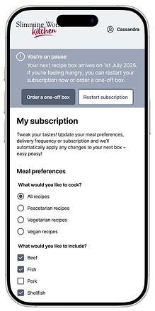
Introduced the pause flow and made it simple and easy to complete
Cancellation flow
3.


4.
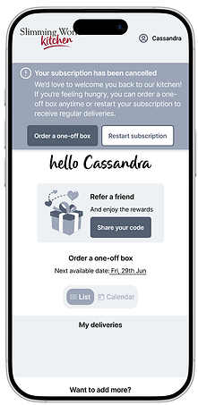


The confirmation banners and modals
Conclusion
The pause and cancellation project aimed to address key friction points in the user journey by providing more intuitive, user-friendly options for subscription management. Through careful research, stakeholder collaboration and iterative design, I developed a solution that balances business needs with user experience. While the current version reflects a thoughtfully crafted experience, the next phase of this project involves user testing to validate design decisions and uncover any usability gaps. The feedback collected will inform final refinements and ensure the solution delivers meaningful impact for both user and the business.